




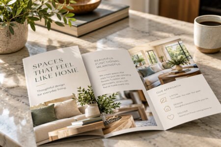
Good design always looks effortless.
Good design should look effortless. Creating it isn’t.
I recently meant to type the word “effortless.” Instead, I typed “effortmess.”
And I may have accidentally invented the perfect word for what happens when people try to design their own marketing materials.
You know the effortmess. The logo is a little too big. There are four fonts because they all seemed like good choices. Everything is bold because everything is important. The photo *almost* fits. The type is getting smaller because there’s just one more thing that needs to go on the page. And somehow, after hours of moving things around, it still doesn’t quite look right.
That’s not because the person creating it lacks good taste. Good design is a skill.
Why Good Design Looks Easy—and Almost Never Is
An experienced graphic designer is making dozens of decisions you probably never notice: hierarchy, spacing, typography, proportion, contrast, color, image quality, alignment, readability, and, perhaps most importantly, what to leave out.
When those decisions are made well, the result looks obvious. Natural. Easy.
Effortless.
That’s one reason small business owners sometimes underestimate what professional design brings to the table. They see the finished piece, not all the decisions that made it work.
And yes, I can usually fix the flyer, ad, brochure, social graphic or other effortmess you created yourself.
But here’s an even better idea: Hire an experienced graphic designer before you create the effortmess.
You can spend your time doing what you do well, and I’ll spend mine making your business look like you do it well.