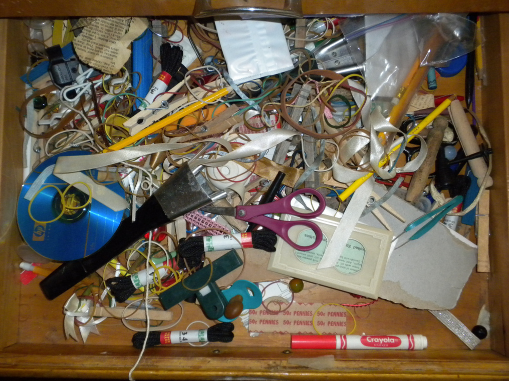
Ugly ads can have the reverse effect on your business.
Instead of attracting people, your ugly ad will repel people. Instead of the 2 to 3 seconds a potential customer may spend looking at an ad, your ugly ad will cause them to turn the page.
How to Identify an ugly ad
All text with no pictures. No one will take the time to read your copy heavy ad, even if you include the word “FREE” in big letters. Everyone loves a pretty picture. Pull customers in with a dreamy location, or a beautiful product shot.
A pretty picture with too much text printed over it. You started off in the right direction, but then you made it ugly when you added too much copy. Stick to including the basics: tagline, special offer, contact information.
A dark or blurry image. Is your photo off center or distorted? Is there unnecessary junk or other distractions in the background? Do you really think you can take a professional photo in 30 seconds? Hire a photographer.
Just because you can doesn’t mean you should. You can add all types of cool effects to text and images: drop shadows, bevels, patterns, embossed type, and so on. If this is the best part of your ad, you are in need of a graphic designer. The best part of your ad should be your brand or product, not the cool effect you applied to that image or text.
Colored text. Limit colored text. The best ads don’t use colored text. Call me a purist, but I haven’t seen an ad for Lexus, or a stay at a luxury hotel, that used pink or bright green type.
Clip art. Nothing says “I made this myself” like clip art. Great for school bulletin boards, bad for print ads.
Font size and style. This is a problem for most folks creating their own ads. Limit fonts to no more than 3 styles. Vary font size for impact. If everything is set in 12 point type, your ad will look copy heavy. If everything is set using a cursive script, no one will take the time to read it. Save cursive script for wedding invitations.
You have 2 to 3 seconds to make an impact. Don’t waste it!


